Category: CSS
-

Twitter polls for developer sentiment
Yesterday, I wrote about how I reason about developer needs and the kinds of data I take into account. Unsurprisingly, many of you wondered what kind of twitter polls I was talking about. Between 100 and 2000 developers answered most of these questions. BIG CAVEAT: twitter polls have issues like no demographics info, audience bias,…
-
What are developers thinking?
I’m hearing on twitter, mastodon, and other social networks that people don’t trust surveys of developer opinions or needs. I’m here to say, good, you probably shouldn’t! Every source of information has a bias of some kind. You know you are doing the right thing when you find directional alignment across different sources of information…
-
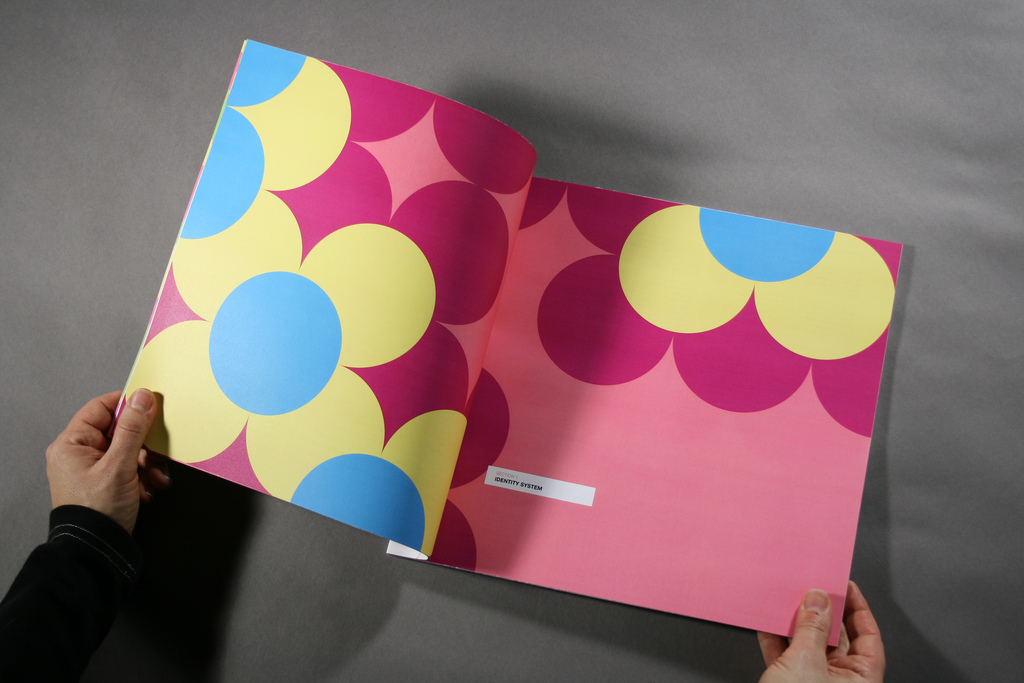
Style Guide Driven Development
Colin O’Byrne and I talk about SDD, a term that was coined in the New York office of Pivotal Labs. Photo Credit: Eastern Market Identity Guide by Daryl Tanghe
-
Re-visiting the secret power of block fomatting context
Recently I did a quick talk at Sydney Web Apps meetup about block formatting context, focusing on how it changes the way it interacts with floated elements. I first learnt about this “secret weapon” via Nicole’s blogpost but it wasn’t until recently that I really understood how useful it is. In my talk I talked about how…
-
Easy-peasy Rem Conversion with Sass
I love rem. I’ve been using it since I first read about it in Jonathan Snook’s article, and even more so since I started building responsive websites. So what is rem? Rem is a value that is relative to the root font-size, meaning the font-size that is set on the <html> element. The browser by…
-
Creating Living Style Guides to Improve Performance
I recently spoke at JSConf about my experience working with Trulia to create a living style guide. The goal for the project was to improve performance, team velocity, and also to have a more consistent design. It was such a fun project (because their engineers were great to work with) and also successful on all…
-
CSSConf – The selection process
CSSConf – This is your conference. Last week we invited the CSS community to submit talks for the upcoming CSSConf (May 28th, Amelia Island, FL). The CSS community has an excellent history of curated conferences, and yet we want to do something a little bit different. We want to see what you have to say!…
-
Cross-Browser Debugging CSS
I was helping Laura (a developer who works with me) learn about cross-browser debugging this week, which got me excited to share my process. The first principal is simply: Work with CSS, not against it. CSS has an underlying design and when you work with it, with the natural flow of how CSS is meant…
-
Code formatting for CSS Gradients
I may have found a way to format CSS3 Gradients that doesn’t make my eyes bleed. Yippee! I was talking to @glan the other day about CSS3 gradients. We were discussing how to break them down into understandable layers and the difficulties when things you need to know about may be split across multiple properties.…
-
Scope donuts
Note: This article is esoteric-could-be-should-be wishing for future browsers. If you only like to hear about what you can use right now, you won’t like this. You’ve been warned. 😉 At first, when the HTML5 working group added the scope attribute I was skeptical. I thought, “oh dear, this is going to be another way…